


The KGW Great Food Drive has been through many design iterations over the years. Initially an all-blue palette built with natural materials and wooden boxes, the brand kept to a slightly nostalgic and weathered vibe. It fit the tone and subject matter well, and served us well.


But with time we started to find more vitality in the boldest colors of nature—red, greens, blues--and for several years the brand style of the campaign incorporated this color scheme. This was lively and striking, and it worked well for print, digital, and video.


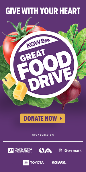
In 2021, I landed on a logo treatment that felt different: a flower of vegetables, cheese, and fruits opening around the logo. This was supposed to be an animation treatment for the 2021 campaign, but early in the process I realized this approach would have a longer life. Combined with a simple, elegant background in any of the three signature colors, the campaign brand had matured into something that felt permanent.


And then came Mariah Taylor. This profile piece for the campaign stood out. We liked Mariah so much, and it was clear this would be the signature piece of the campaign.
- “Mariah”
- Producer: Skyler Stever
I decided to make a special purple background to match the striking purple in her dress. I liked how it worked immediately, and once we saw it on air, the rest of the campaign design felt hollow in comparison.
The next year, we went all-in on Mariah Purple, with its complement Mariah Gold. The result is distinctive, bold, and graceful.


- “Anthem”
- Producer: Skyler Stever
Purple, red, green, or blue, the Great Food Drive raises more than 2 million meals for Oregon families, one of KGW’s most impactful campaigns.